January 9, 2024

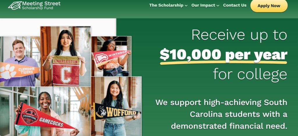
The Meeting Street Scholarship Fund is all about making things easier for college-bound students, and that’s the premise behind its recently redesigned website.
The Scholarship Fund has modernized its website to be more user-friendly and accessible. The Scholarship Fund team worked with Truematter, a team of user-experience experts for digital products, to structure and design the website. The Scholarship Fund team chatted with Truematter about the project.
Meeting Street Scholarship Fund: Tell us a little bit about how the redesigned website is an improvement for visitors.
Truematter: The new website makes it easier for students and parents to immediately learn application timelines, check eligibility requirements and show them how to apply.
Meeting Street Scholarship Fund: What were some of the factors you considered as you redesigned the site?
Truematter: We considered how finding and understanding scholarship criteria isn’t always easy. We wanted to make sure students and parents felt prepared and informed before they decided whether they wanted to apply for the Scholarship. In order to do that, we revised the entire content approach of the site to make the Scholarship information easy to understand and use.
We also wanted to show how much the Meeting Street Scholarship Fund has grown. As a relatively new scholarship, it was important to build the Scholarship’s reputation. We carefully considered where and how we could showcase Meeting Street Scholarship Fund’s impact on students’ academic futures throughout South Carolina.
Meeting Street Scholarship Fund: What’s one new feature you want to highlight?
Truematter: The Meeting Street Scholarship Fund is mobile-friendly. Students and parents primarily access online information from their phone, and that trend will only continue. It was important to Meeting Street Scholarship, and to us, to make sure that students could access information about the scholarship and Meeting Street Scholarship’s application portal from mobile devices.